Charting the Course: A Journey Through Technical Analysis, Emotional Terrain, and Risk Landscapes in Trading
Welcome to our comprehensive guide on the art of technical analysis! Technical analysis is a powerful trading discipline used to evaluate investments and predict future price movements by analyzing statistical trends derived from trading activity. By studying charts and using various indicators, traders can gain insights into market sentiment and make informed decisions. In this guide, we will cover the fundamental principles of technical analysis, explore popular indicators and patterns, and provide practical insights for applying these tools in your trading strategy.
TECHNICAL ANALYSISMARKET PSYCHOLOGYRISK MANAGEMENTTRADING PSYCHOLOGYMARKET DYNAMICSTRADING STRATEGIESINVESTMENT EDUCATION


The Fundamentals of TA
Technical analysis is based on three fundamental ideas:
Market action discounts everything: This principle implies that all current market information (including economic factors, market psychology, and broad market factors) is reflected in the price. Therefore, a detailed analysis of price action is all that is required.
Prices move in trends: Technical analysts believe that prices trend directionally over time, i.e., up, down, or sideways.
History tends to repeat itself: The repetitive nature of price movements is attributed to market psychology; in other words, market participants tend to provide a consistent reaction to similar market stimuli over time.
Understanding these principles is the first step in grasping the essence of technical analysis. Now, let's delve into some specific indicators that help traders interpret market trends and make informed decisions.
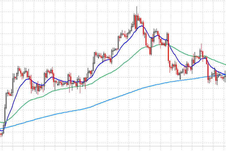
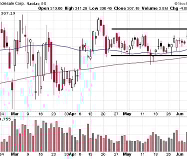
Moving Averages: Simple, Exponential, and Volume Weighted
A moving average is a widely used indicator in technical analysis that helps smooth out price action by filtering out the “noise” from random price fluctuations.
Simple Moving Average (SMA): The SMA is calculated by adding the price of an instrument over a number of time periods and then dividing the sum by the number of time periods. The SMA is basically the average price over the specified period of time.
Exponential Moving Average (EMA): The EMA is a type of weighted moving average that gives more importance to the latest data. It reacts more significantly to recent price changes than the Simple Moving Average.
Volume Weighted Average Price (VWAP): The VWAP is similar to the SMA, but instead of each closing price having the same weight, the VWAP assigns more weight to prices with high volume. It takes into account both the volume and price of a security, which can provide deeper insight into the market's behavior.
Each type of moving average has its own strengths and weaknesses. The SMA is straightforward and easy to understand, but it can be slow to respond to new price information. The EMA and VWAP, on the other hand, give more weight to recent data, which can provide a more timely insight into market trends.
MACD - Moving Average Convergence Divergence
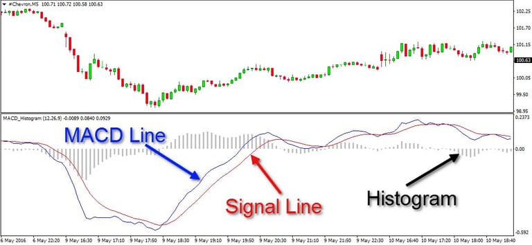
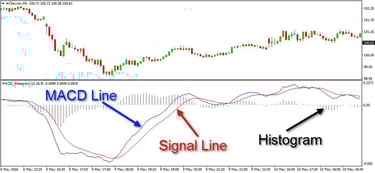
The Moving Average Convergence Divergence (MACD) is a trend-following momentum indicator that shows the relationship between two moving averages of a security’s price. The MACD is calculated by subtracting the 26-period Exponential Moving Average (EMA) from the 12-period EMA.
Here's a more detailed breakdown of the MACD:
MACD Line: The MACD line is the heart of the indicator and by default, it’s the difference between the 12-period EMA and the 26-period EMA. This line is plotted on the chart and forms the baseline for the other components of MACD.
Signal Line: The signal line is a 9-period EMA of the MACD line. This line can trigger trading signals when it crosses above or below the MACD line.
MACD Histogram: The histogram represents the difference between the MACD line and the signal line. When the MACD line crosses above the signal line, the histogram will turn up and cross above the zero line. When the MACD line crosses below the signal line, the histogram will turn down and cross below the zero line.
The MACD generates bullish signals when it moves above its signal line, and bearish signals when it moves below the signal line. The speed of crossovers is also taken as a signal of a market is overbought or oversold.
MACD helps traders understand whether the bullish or bearish movement in the price is strengthening or weakening. It is widely used by traders to identify potential buy and sell points.
However, like all indicators, MACD is not foolproof and can produce false signals. It should be used in conjunction with other technical analysis tools to make more informed trading decisions.
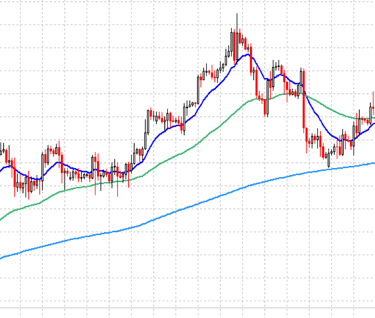
SMA & EMA
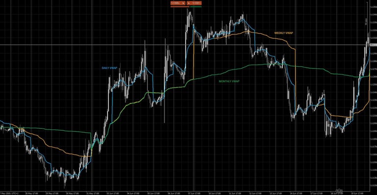
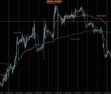
Daily, Weekly, & Monthly VWAP
RSI - Relative Strength Index
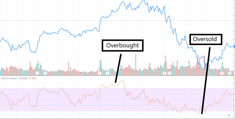
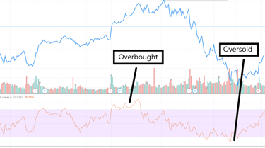
The Relative Strength Index (RSI) is a tool that traders use to gauge the speed and change of price movements. It was created by J. Welles Wilder and first introduced in his 1978 book.
Here's a simplified explanation of how it works:
The Basics: The RSI measures how much the price of a security goes up or down for a set period, usually 14 periods. The result is a number between 0 and 100.
Overbought and Oversold Levels: If the RSI gives a reading over 70, that's traditionally considered "overbought," which means the price might be due for a drop. If it gives a reading under 30, that's considered "oversold," which means the price might be due for a rise. But remember, these are just possibilities, not certainties.
Divergences: Sometimes, the price trend and the RSI don't agree. For example, if the price is going up but the RSI is going down, that's called a bearish divergence and might signal a coming price drop. If the price is going down but the RSI is going up, that's a bullish divergence and might signal a coming price rise.
Failure Swings: These are another form of RSI divergence. A bullish failure swing happens when the RSI goes into the oversold zone, bounces above 30, dips back into the zone, and then breaks above its prior high. A bearish failure swing is the opposite.
Trend Identification: The RSI can also help identify the direction of the trend. If it's mostly above 50, that could indicate an uptrend. If it's mostly below 50, that could indicate a downtrend.
Remember, the RSI is just one tool, and it's not always right. It's best to use it along with other tools and techniques to make your trading decisions.
Stochastic Oscillator
The Stochastic Oscillator is a tool used by traders to measure momentum in the market. It compares the closing price of a security to its price range over a set period of time. Here's a simplified explanation of how it works:
The Basics: The Stochastic Oscillator consists of two lines, called %K and %D. The %K line is the main line, and the %D line is a moving average of the %K line. When you look at a chart, the %K line is usually solid, and the %D line is usually dotted.
How It's Calculated: The Stochastic Oscillator uses a formula that takes the most recent closing price, the lowest price, and the highest price over a certain period (usually 14 trading sessions). The result is a number between 0 and 100.
Overbought and Oversold Levels: If the Stochastic Oscillator gives a reading over 80, that's traditionally considered "overbought," which means the price might be due for a drop. If it gives a reading under 20, that's considered "oversold," which means the price might be due for a rise. But remember, these are just possibilities, not certainties.
Divergences: Sometimes, the price trend and the Stochastic Oscillator don't agree. For example, if the price is going up but the oscillator is going down, that's called a bearish divergence and might signal a coming price drop. If the price is going down but the oscillator is going up, that's a bullish divergence and might signal a coming price rise.
Crosses: When the %K line crosses up through the %D line, that's often seen as a bullish (buy) signal. When the %K line crosses down through the %D line, that's often seen as a bearish (sell) signal.
Trend Identification: The Stochastic Oscillator can also help identify the direction of the trend. If it's mostly above 80, that could indicate an uptrend. If it's mostly below 20, that could indicate a downtrend.
Remember, the Stochastic Oscillator is just one tool, and it's not always right. It's best to use it along with other tools and techniques to make your trading decisions.
OBV - On-Balance Volume and Volume Flow
OBV is a technical trading momentum indicator that uses volume flow to predict changes in stock price. The theory is that when volume increases sharply without a significant change in the stock's price, the price will eventually jump upward, and vice versa. The OBV indicator is a testament to the idea that all market information, including trading volume, is reflected in the price.
Volume is a measure of how much of a given financial asset is traded within a specific period of time. It is a key parameter that traders and investors use to see market trends and liquidity, which in turn can signal potential trading opportunities. Volume flow, in particular, is a concept that refers to the total quantity of shares or contracts traded for a specific security.
The predictive significance of volume flow lies in its ability to reflect the intensity or conviction of traders. High volume levels often occur at market tops and bottoms, as traders turn around their positions. When volume increases, it means traders are actively buying and selling, which can influence the price movement.
For example, if a stock's price increases on high volume, it means that a large number of shares are changing hands, and the price movement is strong. This could be a bullishsignal that the stock's price may continue to rise. Conversely, if a stock's price decreases on high volume, it means that selling pressure is high, and the stock's price may continue to fall.
Volume flow can also help identify trends. In an uptrend, volume should increase when the price rises and decrease when the price falls. This is because the rise in price should be fueled by increased buying pressure, which would be reflected in the increased volume. Similarly, in a downtrend, volume should increase when the price falls and decrease when the price rises.
However, like all indicators, volume flow should not be used in isolation. It is most effective when used in conjunction with other indicators and analysis techniques to confirm signals and avoid false positives.
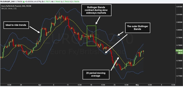
Bollinger Bands and Standard Deviation
Bollinger Bands are a volatility indicator that creates a band of three lines—the middle line is a simple moving average (SMA), and the outer lines are standard deviations away from the SMA. When the price is near the upper band, the asset is considered overbought, and when it's near the lower band, it's considered oversold.
Standard deviation is a statistical measure that quantifies the amount of variation or dispersion of a set of values. In the context of Bollinger Bands, standard deviation measures how much a security's price deviates from its mean price. The bands expand and contract based on the standard deviation, which changes as volatility increases or decreases.
The predictive significance of Bollinger Bands comes from the statistical properties of standard deviation. In a normal distribution, about 95% of the data will fall within two standard deviations. Therefore, when the price of a security reaches the upper or lower band, it's considered statistically significant, and a reversal is likely.
This is because when prices continually touch the upper Bollinger Band, the prices are thought to be overbought; conversely, when they continually touch the lower band, prices are thought to be oversold, triggering a buy signal.
However, it's important to note that periods of high volatility can widen the bands significantly, leading to potential false signals. Similarly, periods of low volatility can narrow the bands, making them less useful for predicting price breakouts. Therefore, Bollinger Bands are best used in conjunction with other indicators to confirm potential price actions.
An example of Bollinger Bands.
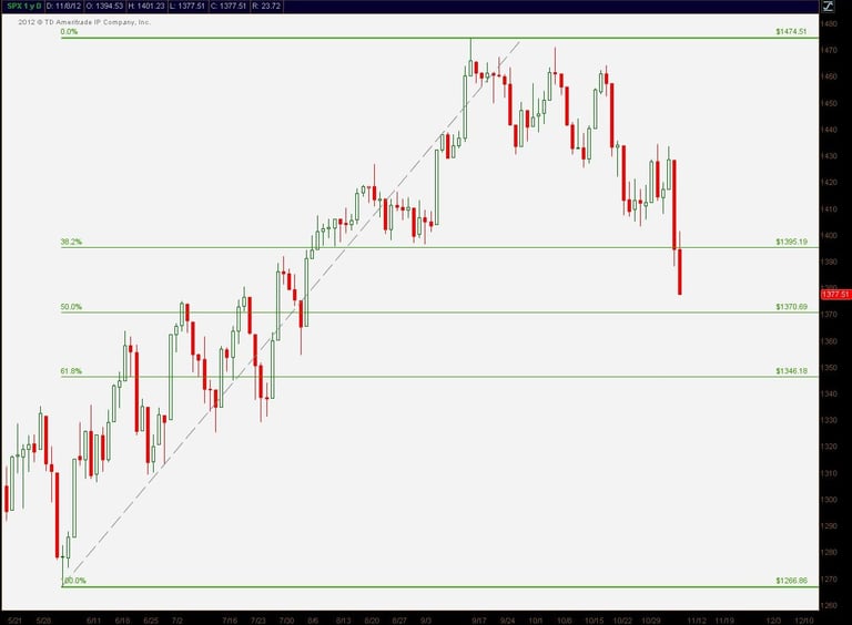
Fibonacci Retracement Indicator
Price Ranges
Price ranges, referring to the difference between the low and high prices for a security or index over a specific time period, play a crucial role in technical analysis. They offer insights into market volatility, with larger price ranges indicating higher volatility often associated with market reversals, and smaller ranges suggesting lower volatility typically seen during steady trends. The position of the price within the range can also signal the strength of a trend. For instance, a price persistently in the upper half of the range suggests a strong uptrend, while a price lingering in the lower half indicates a robust downtrend. Moreover, consistent proximity of the price to the range's edges may hint at potential reversals. It's important to consider the time frame when interpreting price ranges, as what appears significant on a 15-minute chart may not hold the same weight on a daily chart. Understanding price ranges can aid in the development of trading strategies, such as range trading or breakout strategies, providing traders with a more comprehensive view of the market and aiding in more informed decision-making.
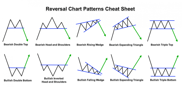
Chart Patterns
Chart patterns are distinctive formations created by the movements of security prices on a chart and form the foundation of technical analysis. A pattern is identified by a line connecting common price points, such as closing prices or highs or lows, during a specific period of time. These patterns can signal whether a trend will continue or reverse, providing valuable insight for traders. Examples of common chart patterns include head and shoulders, double tops and bottoms, triangles, flags, and wedges. Each pattern has its own implication and characteristics that traders use to make informed decisions.
Head and Shoulders: This is a reversal pattern consisting of three peaks, with the middle peak (the head) being higher than the other two (the shoulders). According to some studies, the success rate for head and shoulders patterns is estimated to be around 60-65%, meaning that they tend to accurately predict trend reversals more often than not.
Double Tops and Bottoms: These patterns occur when the price reaches a resistance level twice (double top) or a support level twice (double bottom) before reversing. The success rate for double tops and bottoms is also approximately 60-65%, indicating a relatively reliable pattern for identifying trend reversals.
Triangles: Triangles are continuation patterns that show a contraction in price range, indicating a temporary consolidation before the continuation of the previous trend. The success rate of triangle patterns is typically estimated to be around 70%, implying a higher probability of the trend continuing in the direction prior to the formation of the pattern.
Flags and Pennants: Flags and pennants are short-term continuation patterns that occur after a strong price movement. They are characterized by a small consolidation period before the price resumes its previous trend. The success rate for flags and pennants is generally considered to be around 60-65%.
Wedges: Wedges are patterns characterized by converging trend lines moving in either an upward or downward direction. They can indicate both continuation and reversal patterns, depending on the direction of the wedge and the preceding trend. The success rate for wedges varies depending on the specific type and market conditions, but it is generally estimated to be around 55-60%.
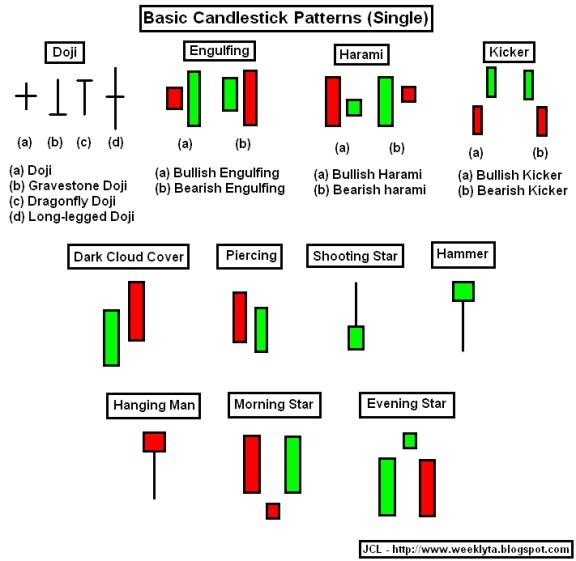
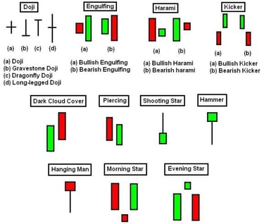
Candlestick Patterns
Candlestick patterns are a method of reading the price chart of an asset which originated in Japan. They provide useful information about market sentiment and potential reversals in the market. Candlestick charts show four price points (open, close, high, and low) within a specific time period, forming patterns that traders interpret to predict future price movements. Examples include the Doji, Hammer, Engulfing, and Shooting Star patterns.
Doji: Doji patterns indicate market indecision and potential reversals. Their success rate depends on the context in which they appear and the confirmation from other technical factors. In isolation, Doji patterns may not provide high accuracy for predicting future price movements.
Hammer and Hanging Man: Hammer and Hanging Man patterns are considered reversal signals, especially when they appear at the end of a trend. The success rate of these patterns can vary, but they generally indicate a higher probability of a reversal when supported by other technical factors and occur after a sustained trend.
Engulfing: Engulfing patterns, both bullish and bearish, suggest a potential trend reversal. The success rate of engulfing patterns can range from moderate to high, depending on factors such as the strength of the trend, the time frame being analyzed, and confirmation from other indicators.
Shooting Star and Inverted Hammer: Similar to Hammer patterns, Shooting Star and Inverted Hammer patterns indicate potential reversals. Their success rates can vary, and they should be used in conjunction with other technical analysis tools for confirmation.
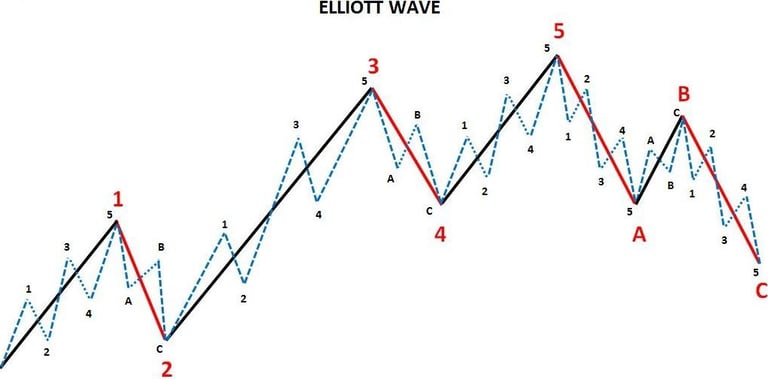
Elliott Wave Theory
The Elliott Wave Theory is a technical analysis approach developed by Ralph Nelson Elliott in the 1930s. It aims to identify and analyze recurring patterns in financial markets based on the principles of crowd psychology and investor sentiment. The theory suggests that markets move in repetitive cycles of upward and downward waves.
Key concepts of the Elliott Wave Theory include:
Wave Principle: The core premise of the theory is that market movements follow specific wave patterns that can be observed across different time frames. These waves are composed of impulsive waves (trending upward) and corrective waves (trending downward).
Five-Wave Pattern: According to Elliott's theory, an upward trend unfolds in a series of five waves labeled as 1, 2, 3, 4, and 5. Waves 1, 3, and 5 represent the impulsive phases, while waves 2 and 4 represent corrective phases. These waves collectively form an "up" cycle.
Three-Wave Pattern: After the completion of the five-wave pattern, a corrective phase occurs, consisting of three waves labeled A, B, and C. This corrective pattern temporarily counters the preceding trend.
Fractal Nature: The Elliott Wave Theory also emphasizes the fractal nature of market patterns, which means that smaller wave patterns within a larger wave pattern exhibit similar characteristics and proportions. This principle suggests that the same wave patterns can be observed on different time scales.
Traders and analysts who employ the Elliott Wave Theory use various tools, such as trend lines, Fibonacci retracements, and oscillators, to identify and validate wave counts and patterns. The theory aims to predict future market trends by analyzing the relationship between these waves, seeking to anticipate potential turning points and areas of support or resistance.
It is important to note that the Elliott Wave Theory is subjective and requires skill and experience to apply effectively. Critics argue that wave identification and interpretation can be subjective, leading to different wave counts and potentially unreliable predictions. Additionally, market complexities and unpredictable events can challenge the accuracy of wave analysis.
Traders who choose to incorporate the Elliott Wave Theory into their analysis often use it in conjunction with other technical analysis tools and indicators to increase the probability of successful trading decisions.
Ichimoku Cloud
The Ichimoku Cloud is a collection of technical indicators that show support and resistance levels, as well as momentum and trend direction. It does this by taking multiple averages and plotting them on a chart, providing a comprehensive picture of the market conditions. The cloud, or 'Kumo', is the space between two lines plotted on the chart and is often shaded in to easily show whether the market is in a bullish or bearish trend.
The Ichimoku Cloud, also known as Ichimoku Kinko Hyo, was developed by Goichi Hosoda, a Japanese journalist, and published in the late 1960s. The name Ichimoku Kinko Hyo translates to "one look equilibrium chart," reflecting the developer's intent to create a comprehensive, all-in-one indicator that provides a "one look" view of the market. Hosoda spent many years perfecting the technique before releasing his findings to the general public. His goal was to create an indicator that could provide a more informed view of the market than the standard candlestick charts used at the time.
The Ichimoku Cloud provides more data points than the standard candlestick chart, offering a richer and more nuanced picture of market dynamics. It shows support and resistance levels, trend direction, momentum, and provides trading signals, all in a single glance. The Ichimoku Cloud's comprehensive nature and its ability to provide a quick understanding of market sentiment and potential future price action have made it a popular tool among traders worldwide. Despite being over half a century old, it remains a relevant and widely used technical analysis method in today's trading world.
Risk Management
Risk management is an absolutely critical component to any trader's overall strategy. It helps cut down losses and can also help protect traders' accounts from losing all of its money. The risk occurs when traders take on too much risk relative to the size of their trading account. Risk management techniques include setting stop losses, determining your trading strategy's win-loss ratio, understanding the average size of your wins and losses, and position sizing.
Setting Stop Losses: A stop loss is an order placed with a broker to automatically sell a security if it reaches a specified price level. It acts as a predefined exit point to limit losses on a trade. By setting a stop loss, traders can define their maximum acceptable loss on a trade, ensuring that they exit a position before the losses become excessive.
Win-Loss Ratio: The win-loss ratio is a measure of the number of winning trades relative to the number of losing trades. By tracking and analyzing this ratio over time, traders can gain insights into the effectiveness of their trading strategy. It helps traders understand their overall profitability and guides them in adjusting their strategies if necessary.
Average Win and Loss Size: Understanding the average size of wins and losses is important for risk management. By analyzing historical trade data, traders can calculate the average profit they make on winning trades and the average loss incurred on losing trades. This information can help in determining appropriate risk-reward ratios and position sizing.
Position Sizing: Position sizing refers to determining the appropriate amount of capital to allocate to a specific trade. It involves considering the potential risk of the trade, the trader's risk tolerance, and the size of the trading account. By properly sizing positions, traders can limit the potential impact of any single trade on their overall portfolio.
Implementing these risk management techniques allows traders to control and mitigate potential losses while protecting their trading capital. It's important for traders to establish a risk management plan that aligns with their risk tolerance, trading strategy, and financial goals. This ensures that they have a systematic approach to managing risk and can make informed decisions regarding trade entries, exits, and position sizing.
In addition to these techniques, traders may also employ other risk management tools such as diversification, setting profit targets, and maintaining discipline in following their risk management plan. By combining these practices, traders can strive for consistency and long-term success in their trading endeavors.
Trading Psychology
Trading psychology refers to the emotions and mental state that help dictate success or failure in trading securities. It represents various aspects of an individual's character and behavior that influence their trading actions. Understanding the emotional aspect of trading is crucial. Topics like dealing with fear and greed, maintaining discipline, and developing patience can be very helpful for traders.
Fear: Fear can manifest in several ways in trading. Traders may fear losing money, missing out on a trade, or even the fear of success. This fear can lead to harmful behaviors such as prematurely exiting trades, holding onto losing trades in the hope they'll turn around, or not entering a trade at all. For example, a trader might exit a position as soon as they see a small profit for fear of the market turning against them, missing out on potential larger gains.
Greed: On the other end of the spectrum, greed can cause traders to ignore their exit strategy and hold onto winning positions in the hope of gaining even more profit. This can backfire when the market suddenly reverses. Greed can also lead to overtrading, where traders risk too much capital or make trades without proper analysis in the hope of making quick profits.
These emotions can cloud judgment, leading traders to stray from their trading plan and make impulsive decisions based on short-term events rather than long-term trends and analysis. This is why it's crucial to have a solid trading plan and stick to it, regardless of short-term market fluctuations and emotions that may arise.
One way to manage these emotions is through the use of stop-loss and take-profit levels. More strategic traders may even use indicator signals to tell them when they should close a position rather than specific price levels. By setting these parameters in advance, traders can make decisions based on a predefined strategy rather than being swayed by emotions. Another method is to practice mindfulness and emotional awareness, recognizing when emotions are starting to influence trading decisions and taking steps to return to a more rational and objective state of mind.
While a trading strategy might be near perfect on paper, it's the trader's ability to manage their emotions and stick to the plan that often determines success in the markets. Emotional discipline is just as important as technical and fundamental analysis in achieving consistent trading results.
Imperfect Information
Despite the comprehensive nature of TA, it's important to remember that no indicator or set of indicators will perfectly predict the market's movements. TA is a tool, not a guarantee. It's always important to use risk management techniques and consider the broader market context when trading.
TA is a powerful tool for navigating the financial markets. By understanding the various indicators and concepts, traders can make more informed decisions and increase their chances of trading success. From the principles of market action, price trends, and history repetition, to the specific indicators like MACD, RSI, OBV, Bollinger Bands, and Fibonacci levels, each tool offers unique insights into market behavior. The beauty of TA lies in the harmonious interplay of these tools, painting a comprehensive picture of the market for those who have learned how to interpret it.
An example of the RSI.
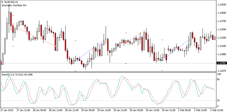
An example of the Stochastic Oscillator.
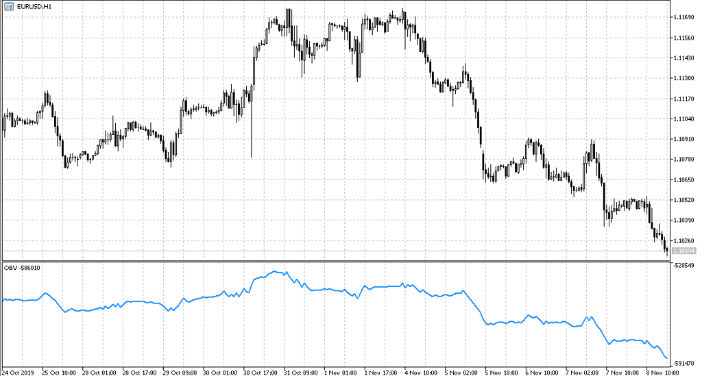
An example of the OBV indicator.
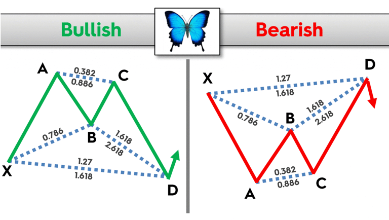
Fibonacci Retracement and Harmonic Patterns
Fibonacci Retracement is a technical tool used to plot horizontal lines to indicate potential levels of support or resistance at the key Fibonacci levels before the price continues in the original direction. These levels are derived from the Fibonacci sequence, a series of numbers where each number is the sum of the two preceding ones.
Fibonacci levels work because traders all around the world watch these levels and place buy and sell orders on these levels which can often result in these price predictions becoming a self-fulfilling prophecy. Moreover, Fibonacci levels often coincide with other levels of support and resistance, adding to their strength.
One of the fascinating aspects of Fibonacci levels is their role in the formation of harmonic patterns. Harmonic patterns are precise patterns in the financial markets that are created by price movements which adhere to the Fibonacci number sequence or ratios. These patterns can be used to identify high probability, high reward-to-risk opportunities.
These patterns are named after the sequences and shapes they create, which often mirror those found in nature and are mathematically sound. One of the most common harmonic patterns goes by many names. It can be called the Gartley, Butterfly, Bat, or Crab pattern.
Also known as the "222" pattern, it uses Fibonacci numbers to determine the completion and reversal of the pattern. The pattern consists of an initial leg, a retracement, a second leg, another retracement, and a final leg, with each leg representing a particular Fibonacci ratio.
The beauty of harmonic patterns lies in their ability to provide traders with specific zones for potential market reversals, often before they occur. This predictive ability, combined with the use of risk management, can lead to high-probability trading opportunities.
However, it's important to note that, like all trading strategies, harmonic patterns are not foolproof and should be used in conjunction with other forms of analysis. Additionally, they require a good deal of practice and understanding to use effectively.
Support and Resistance Levels
Support and resistance levels are fundamental concepts in technical analysis, representing key points on a chart where the forces of supply (resistance) and demand (support) meet. These levels are seen as crucial in determining market psychology and the balance of supply and demand.
Support is a price level where a downtrend is expected to pause due to a concentration of demand. As the price of an asset gets closer to the support level, it is believed that demand will increase and help stop the price from falling further. Essentially, support can be thought of as the floor beneath the market.
Resistance, on the other hand, is a price level where an uptrend is expected to pause due to a concentration of supply. As the price of an asset approaches the resistance level, it is believed that supply will overcome demand and prevent the price from rising further. Resistance can be thought of as the ceiling of the market.
Support and resistance levels are not always exact. They are often represented as a price range rather than a precise level. When the price moves past a support or resistance level, it is thought to be a significant event. The broken support level can become a resistance level and vice versa, a concept known as a "role reversal."
These levels can be identified by connecting the high points where the price has reversed lower (resistance) or the low points where the price has bounced higher (support). They can be used to identify potential entry and exit points for trades.
Support and resistance levels can also be psychological, existing due to traders' collective actions at these price levels. For example, round numbers (e.g., 1.0000 in forex pairs, 100 in stocks, or 1,000 in indices) are common psychological support and resistance levels.
Finally, it's important to note that the more often the price tests a level of resistance or support without breaking it, the stronger that resistance or support level is. When a break does occur, it's a significant event as the price is expected to make a substantial move.
Gartley/Butterfly/Bat/Crab Pattern
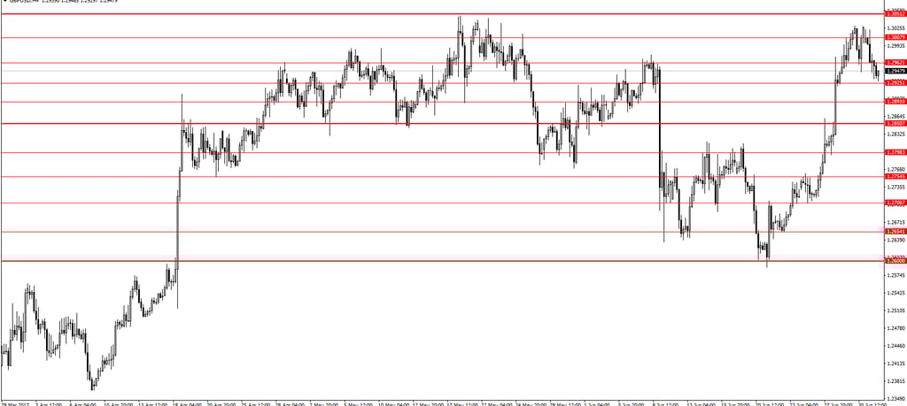
Support & Resistance Levels

A price range
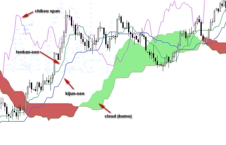
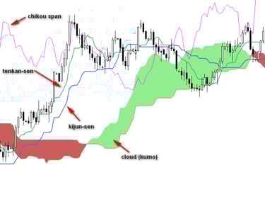
An example of the ichimoku cloud.
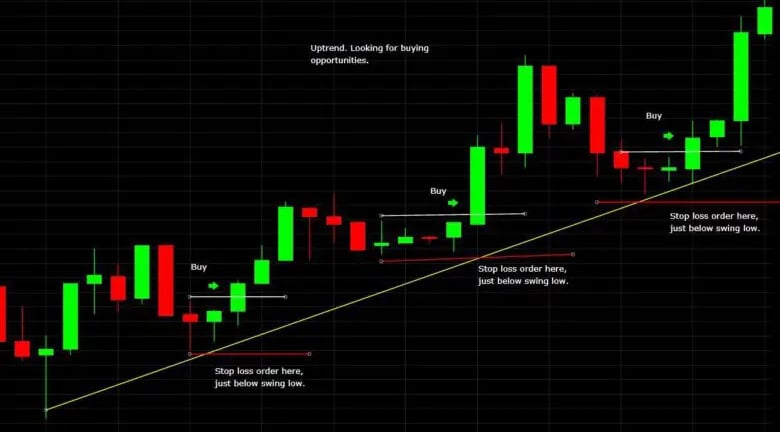
An example of wise stop loss placement.
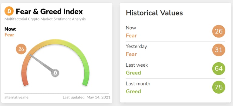
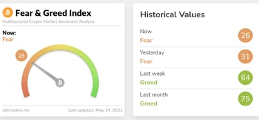
The Bitcoin Fear and Greed index
The Tip of the Iceberg: The Expansive World of Technical Analysis
Technical analysis (TA) is a vast and ever-evolving field that goes beyond the guide provided here. It encompasses advanced chart patterns, such as the Cup and Handle, Pennants, and Diamond formations, which require a deeper understanding of market structure and provide more nuanced trading signals. Traders can explore a wide array of oscillators and indicators, including the Average Directional Index (ADX), Volume Profile, and Rate of Change (ROC), each offering unique perspectives on market dynamics and trend strength. By utilizing complex combinations of indicators in trading systems, traders can gain comprehensive insights into market conditions and make informed decisions.
Furthermore, algorithmic trading and quantitative analysis play significant roles in technical analysis. Algorithmic trading involves using computer algorithms and quantitative models to automate trading decisions based on predefined rules and technical indicators, requiring programming skills and statistical modeling knowledge. Quantitative analysis utilizes mathematical models and statistical techniques to identify trading opportunities, involving complex statistical methods, algorithm development, and backtesting.
Technical analysis also encompasses behavioral finance, which focuses on understanding market psychology and biases that influence financial decision-making. Traders can analyze charts on different timeframes, from short-term intraday trading to long-term investing, and study intermarket relationships to gain broader perspectives and insights.
By recognizing the depth and breadth of technical analysis, traders can engage in continuous learning and exploration, refining their skills to unlock the full potential of technical analysis and identify profitable trading opportunities in the dynamic world of financial markets.
For a deeper look into the underlying forces behind the price action that TA makes use of, read Sailing the Financial Ocean: A Deep Dive into Market Dynamics and the Trader's Journey and The Peaks and Troughs: Unraveling the Dynamics of Bull and Bear Markets.